Earlier this year, YouTube introduced a major redesign of its desktop website which delivered a cleaner look and new features like a “dark mode” for nighttime watching. Today, YouTube is taking this update out of beta, and making it available to all users. In addition, the company is extending the design and select new features to its mobile app, and is unveiling an updated logo and icon.
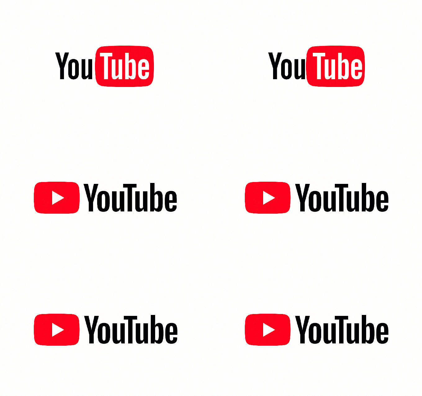
This is the biggest change the YouTube logo has received over the years, as earlier improvements were much more minor tweaks, as you can see in the image below.

Google says this new logo – a cleaned up version of the YouTube wordmark and icon – was designed to be more flexible across devices of varying screen sizes. On smaller screens, YouTube can use just the icon alone to abbreviate its logo, while still making it easy to spot. The updated logo and icon are rolling out across desktop and mobile starting today, before arriving on other apps and services, the company notes.

Meanwhile, the desktop redesign introduced in May is now the default instead of an opt-in beta. This upgrade had included rebuilding YouTube on top of the open source JavaScript library Polymer, which will allow Google to more quickly bring new features to market going forward, it had said at the time.
However, for end users, the most noticeable changes were about the way YouTube looked. The upgraded desktop experience leverages Google’s design language, Material Design, which influences things like how the left-side navigation can now be tucked away with a click on the hamburger menu; the size and placement of key elements; and the overall cleaner look-and-feel.
The desktop update also includes a great “dark mode” for nighttime viewing, giving YouTube a more cinematic feel. Unfortunately, this feature is not making its way over to YouTube’s mobile app today, we’re told.
However, the app is getting a number of new features, too.

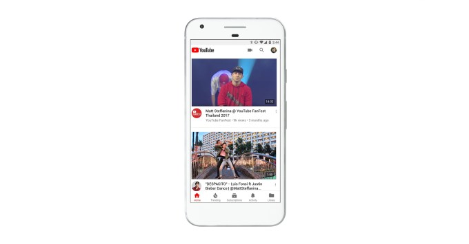
This includes its own take on the cleaner redesign, where the header is now white and the navigation tabs have been moved to the bottom, making them easier to reach with your thumbs.
The big, red YouTube header was a bit gaudy and not well-received when it first rolled out. The new, white header is a serious improvement.
There are also new Library and Account tabs to make it easier to access the things you’re looking for, says Google.

The app will introduce various playback controls, too, including one that uses gestures.
As you may recall, YouTube earlier this year introduced a way to double tap on the left or right side of a video to rewind or fast forward 10 seconds. In the months ahead, the new mobile app will introduce another gesture – a way to jump between videos with a swipe of your hand. You’ll just swipe left to watch the previous video, or swipe right to watch the next. (This is not live today, but is being pre-announced).
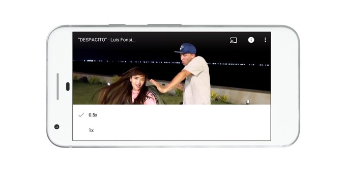
The app will also now include the ability to speed up and slow down the playback of a video, similar to how you can on desktop; and the new player will change its shape to match the video format being viewed. This feature was teased this summer, noting that the rise in vertical video was among the reasons to roll out a more adaptive player.

Another recently launched feature that suggests videos while you’re watching in full-screen mode is included in the update, as well.
The changes to the logo, mobile app, and desktop site will begin rolling out today. YouTube tells us the roll out may not complete until tomorrow, however.
On – 29 Aug, 2017 By Sarah Perez


